From 2-clicks to 1-Click: The untold origins on the making of the iTunes Music Store
The official account (and backstory) on the founding of Apple's content production team
The birth of the iTunes Music Store wasn't just about the introduction of a groundbreaking platform; it was about orchestrating a movement that would breathe new life into a faltering music industry. As part of the team that meticulously composed this digital symphony, I saw firsthand how our creation not only reshaped the landscape of music consumption but also became a lifeline for an industry in crisis.
In my role during the formative years of the iTunes Music Store, I was privileged to be part of a collective of exceptionally talented individuals. As a team, we were not merely tasked with constructing a digital platform; we were united in our mission to weave a rich tapestry that harmonized technology, art, and music into a seamless experience.
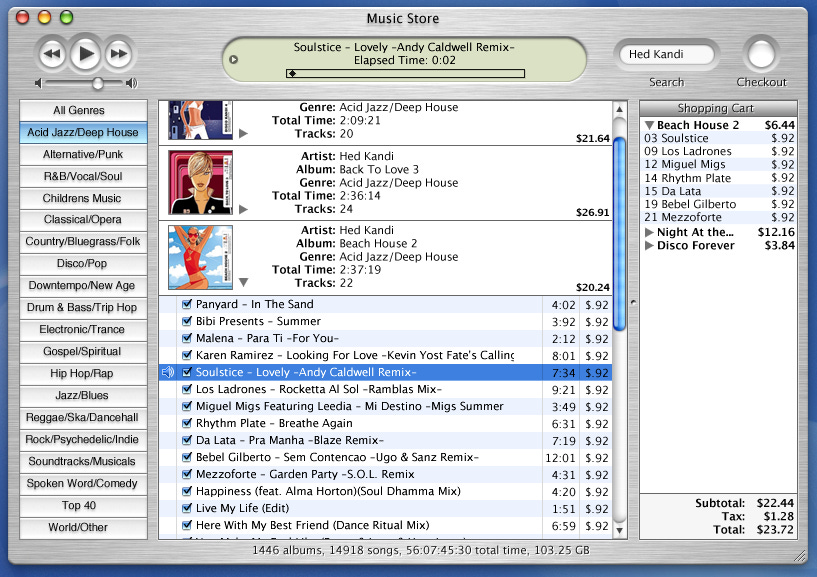
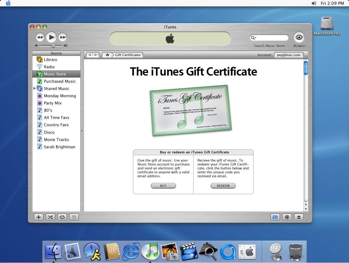
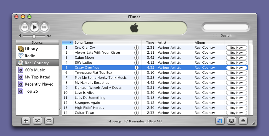
The iTunes Music Store was being prototyped for just over a year before engineering budgets and engineering managers started getting allocated. Steve Jobs had a way with record executives and would meet face to face with the big 5 record labels showing them my design treatments until we arrived at a solution that pleased each of them separately (and then collectively).
My journey began with a vision, ambitious and expansive in its scope, aiming to craft an ecosystem that transcended the conventional.


A Vision in the Midst of Chaos
The turn of the millennium brought with it a digital storm that left the music industry in disarray. Piracy was rampant, and traditional sales were plummeting. Amidst this tumult, our team at Apple was united by a singular vision—to create a platform that not only made accessing music effortless and legal but also respected and celebrated the artistry behind the music.
Syncing Art with Production
Integrating stunning artwork and engaging artist profiles into the operational rhythm of iTunes was a dance of meticulous coordination. We developed processes that ensured these visual and narrative elements not only enriched the user experience but also aligned seamlessly with our release schedules and promotional strategies, making every launch an anticipated event.


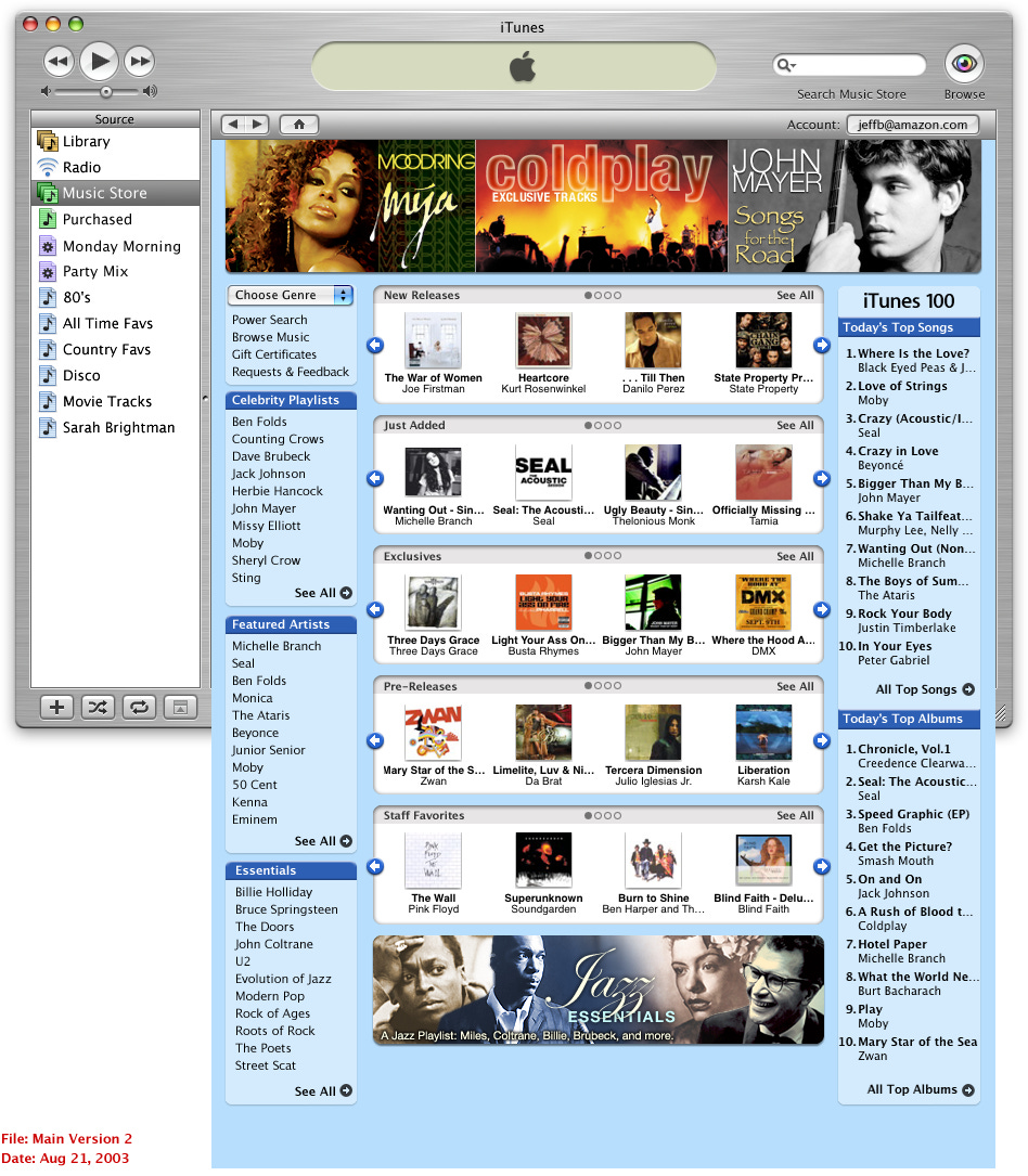
In the nascent stages of crafting the iTunes Music Store, my initial design treatments were rooted in functionality and simplicity, a reflection of Apple's quintessential aesthetic. However, a pivotal realization dawned upon us as the project evolved—the significance of visual storytelling and artist representation within the digital space. The importance of having dedicated areas for bricks, splashes, and additional visual merchandising for artists became increasingly apparent.
This wasn't just about creating a platform for transactions; it was about curating an immersive gallery where each artist's identity and narrative were celebrated. This revelation prompted us to pivot, leading us to discard our initial designs in favor of a more vibrant, visually rich interface. This strategic shift marked a transition from a transactional marketplace to an experiential storefront, enhancing user engagement and forging a deeper connection between artists and their audience.

We cycled through countless design iterations, each a stepping stone towards excellence. The relentless pursuit of a layout that was intuitive yet visually compelling led us to a breakthrough—a design pattern that not only defined the essence of our platform but also set a precedent, becoming a widely embraced blueprint across content stores globally. This journey wasn't just about finding the right design; it was about setting a new standard, crafting an experience that would resonate universally.
We eventually found that visual merchandising space was a lot more valuable than we thought as record labels fought bloody battles over being featured with prime real estate.
For the conception of genre pages in the iTunes Music Store, we would use PSD files to communicate back and forth to make sure we weren't missing any of Steve's pressing feedback for the following design review.

The Visual Orchestra: Composing Artist Pages, Bricks and Splashes
One of the most nuanced chapters in our design narrative was the creation of artist pages, bricks and splashes. These weren't mere sections of the platform; they were canvases where the essence of the artist's spirit was painted in digital strokes. Every piece of artwork, every design element was a note in this visual melody, thoughtfully composed to resonate with the artist's identity and the emotional journey their music embarked upon. Our team, like meticulous artists, curated these visual stories, ensuring they echoed the depth and diversity of the music they represented.
The Symphony of Schedules: Integrating Artistry into Production
Incorporating the artwork into the production schedule was like choreographing a ballet amidst a bustling marketplace. It required not just precision and skill but also an innate understanding of rhythm and flow. We fine-tuned our processes, ensuring that the visual storytelling of our artist pages and artist splashes lived in perfect harmony with the platform's release cycles, a testament to our commitment to visual excellence and operational precision.

The Crescendo: Reviving the Music Industry
The launch of the iTunes Music Store marked a pivotal moment in the music industry. For record stores and labels facing the digital upheaval, iTunes offered a harmonious solution—a platform that countered piracy with accessibility and convenience, turning the tide on declining sales. We didn't just provide an alternative; we offered a revival, a platform where artists could reach audiences worldwide, and where users could explore and purchase music with confidence and ease.
The Ensemble's Legacy: A Chorus of Innovation and Resilience
Looking back, the creation of the iTunes Music Store stands as a testament to what can be achieved when creativity, technology, and a deep understanding of user needs come together in harmony. It was a collective masterpiece, a symphony of diverse talents and visions converging to not only save a dying industry but to set it on a path of resurgence and innovation.
In crafting the iTunes Music Store, we didn't just construct a platform; we sparked a movement. We proved that when designed with empathy and executing with precision, technology can become a powerful force for change—resonating hope, rejuvenating industries, and redefining the very way we experience and celebrate the art of music.
And with every success story, there are always casualties:


Instructions on how to access my design services:
Things I started, enjoy and can help with...
The best way to transform a company’s product line from the inside out is to lock 5 people in a room for three months and tell them not to come out until they’ve redesigned the company. Things I Started: 💌 Apple Webmail 🎁 Apple’s first gift card experience


