


From Paper Ballots to Pixels: Tracing the history of the radio button & checkbox
A history of Design Decisions that Changed How We Make Choices Online

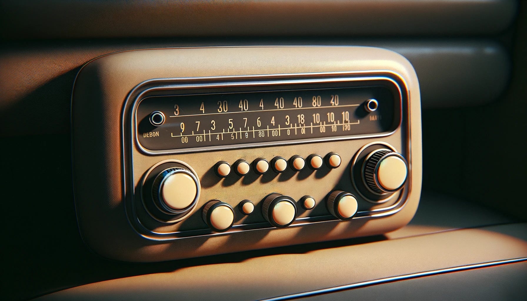
The concept of skeuomorphism in interface design refers to a design principle in which design cues are taken from the physical world to aid users in understanding how to use a digital interface. The radio button and the checkbox are quintessential examples of skeuomorphic design, each with a rich history mirroring their real-world counterparts.
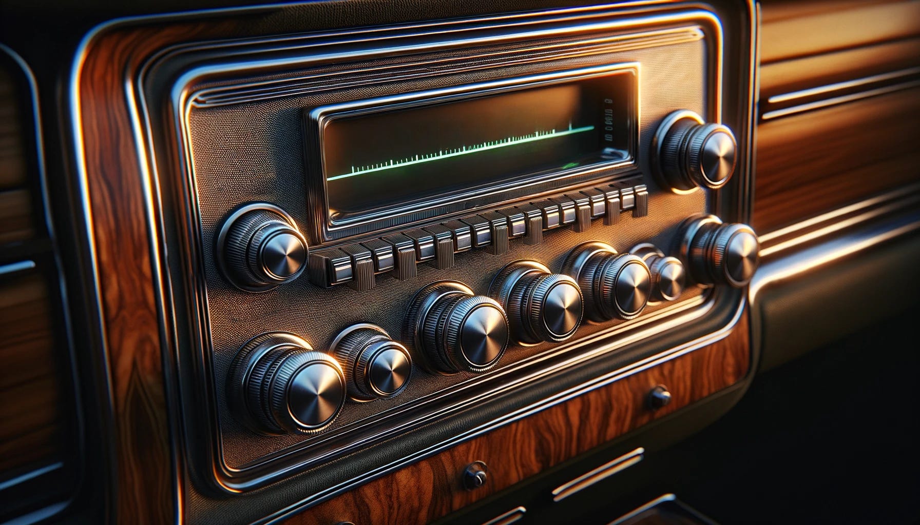
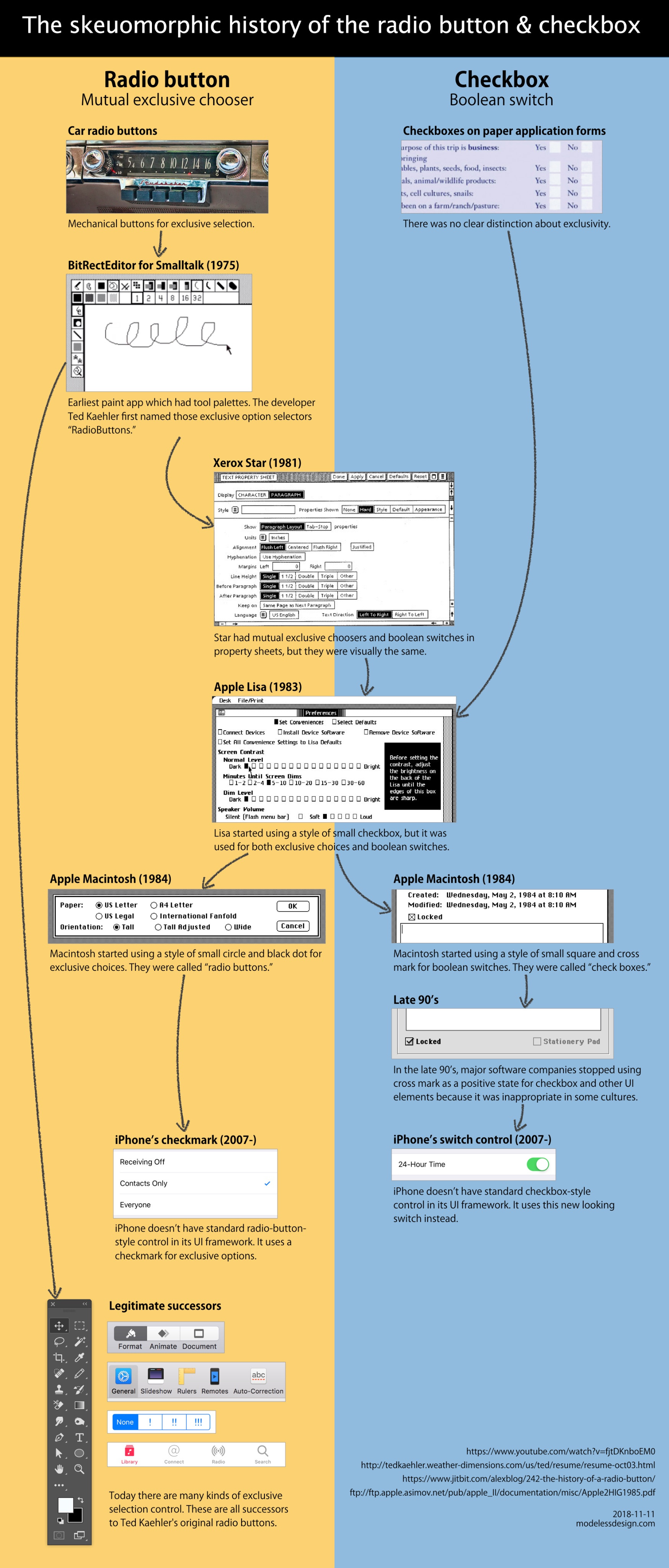
The radio button's journey into the digital realm can be traced back to the car radio buttons of old, where pressing one button would pop out the previously pressed one, enforcing a mutual exclusivity—a concept that found its way into early graphical user interfaces. It was Ted Kaehler who first applied this metaphor to the digital "RadioButtons" in the BitRectEditor for Smalltalk in 1975, allowing users to select one option from a set, just as one would select a single radio station. This design paradigm was further popularized by systems like the Xerox Star and Apple Lisa, which incorporated visually similar elements for both exclusive choices and boolean switches, a testament to the skeuomorphic philosophy of leveraging familiar physical interactions to guide users in a digital environment.

Checkboxes, on the other hand, evolved from their use in paper forms, providing a clear 'Yes' or 'No' choice without implying exclusivity, symbolizing a binary option—checked for "true" or unchecked for "false." This design made its way into the digital interfaces with the Apple Macintosh in 1984, which used small squares and crosses to represent these boolean switches. These checkboxes have evolved over time, adapting to the nuances of digital aesthetics and functionality while retaining their foundational real-world concept. The late 90s saw a shift away from the cross mark as a positive state indicator for checkboxes, reflecting the internationalization of software design where symbols can have different meanings in different cultures.
Today's interfaces continue to honor the legacy of the radio button and checkbox, albeit in evolved forms that accommodate contemporary design standards and technological capabilities. The iPhone, for example, eschewed the traditional radio button for a checkmark within lists to indicate selection, while introducing a new UI element—the switch control—which provided a clear visual cue for toggling between two states. These modern adaptations of Kaehler's original concepts highlight the enduring relevance of skeuomorphic design principles, subtly guiding users through the digital experience by drawing upon the intuitive knowledge of the physical world.
Below: The history of the radio button & checkbox by Manabu Ueno
A special invitation from Michael…
Dear readers,
In the spirit of craftsmanship that has always driven our work, I'm excited to share a unique opportunity to be part of a narrative that redefined the digital era. To honor the contributions of our community, I am offering a 20% discount which is good forever for those who join as annual members in the next chapter of this adventure: a book that captures the essence of our design breakthroughs.
Founding members will be acknowledged on the book's donors page in addition to their year membership. Your support is pivotal in bringing this story to print—a story that intertwines technology, design, and the human experience in ways that have forever altered how we interact with the digital world.

Your engagement as either an annual member or a founding member will not only help preserve the rich history of design that we have crafted together but will also continue to inspire future generations of creators and innovators.
I look forward to rekindling the magic that we created and sharing it with the world through your eyes and stories.
Warm regards,
Michael Darius
Darius/Design
Join the conversation on Twitter / X - @darius