Navigating Digital Shelves: The Legacy of iTunes Design
How Apple's iTunes Interface Paved the Way for Modern Content Discovery
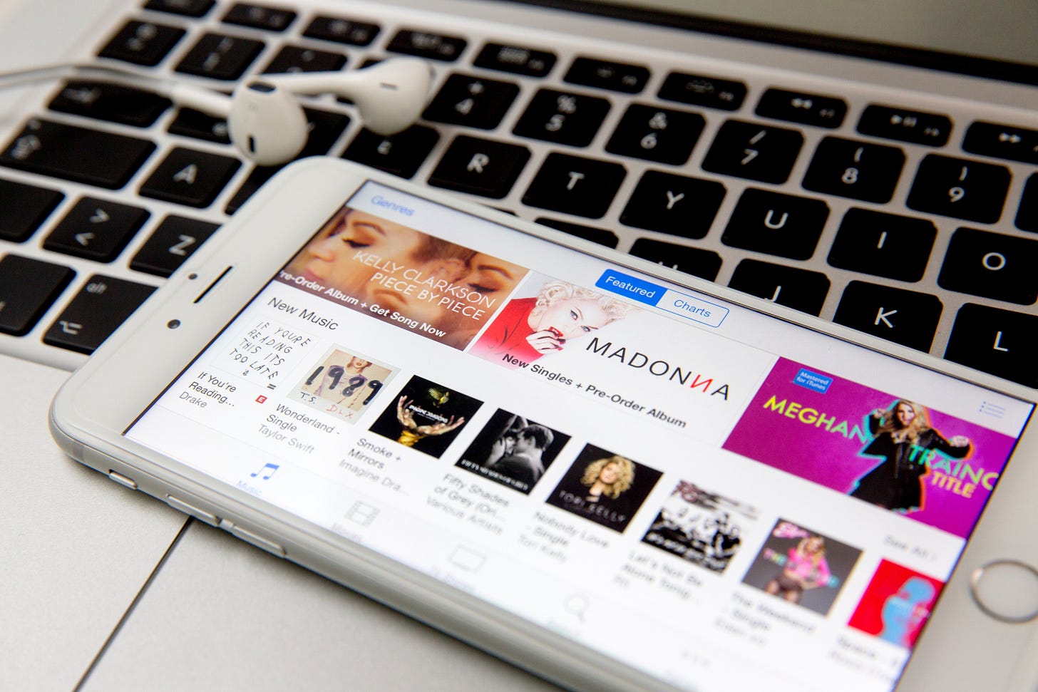
Another timeless design pattern emerged from the iTunes Music Store, featuring three prominent splashes at the top with a carousel of albums and a grid of 'bricks' below, has become a touchstone for digital content navigation. This layout, which we developed, not only provided a visual anchor but also a navigational rhythm that users found familiar and approachable. The top splashes were more than just eye-catching; they served as a marquee to showcase featured content, while capturing user interest from the moment they entered the store.
Below the splashes, the carousel allowed for a dynamic exploration of content, offering a horizontal journey through albums, apps, or shows. This design element provided a sense of serendipity and discovery, akin to browsing through a record store where the latest or most popular items catch the eye. It was about creating a narrative flow in the digital shopping experience, where the highlighted content could tell a story, whether it was the latest hits, seasonal collections, or curated playlists. The grid of 'bricks' or tiles beneath the carousel served a different purpose. It provided structure and order, allowing for a more systematic search and exploration of the catalog. This element of the design gave users the freedom to dive deeper into specific categories or genres. By combining the splash and carousel with the brick grid, we struck a balance between guided discovery and user-driven exploration, which has been widely adopted across the industry.
The success of this design was amplified by the way it streamlined content scheduling and provided vendors with dynamic spaces for visual merchandising. The rich areas at the top of the iTunes interface allowed content creators and distributors to craft visually compelling narratives for their offerings. This not only enhanced the aesthetic appeal of the store but also made it easier for vendors to manage and schedule their content. The result was a more vibrant and fresh storefront that could quickly adapt to new releases and trends, making the digital space feel as curated and alive as any physical retail environment.
This approach was inspired, in part, by our experience with Hear Music's retail store's "listening areas." We were captivated by how these physical spaces allowed customers to explore music organically, with an emphasis on the sensory experience. It was this human-centric, exploratory approach that we sought to emulate digitally. We wanted to capture that sense of personal discovery and translate it to the screen, providing a space where users could not only find what they were looking for but also stumble upon something new and exciting. This philosophy became a cornerstone of our design and contributed to creating an online marketplace that was not just a store but an experience.
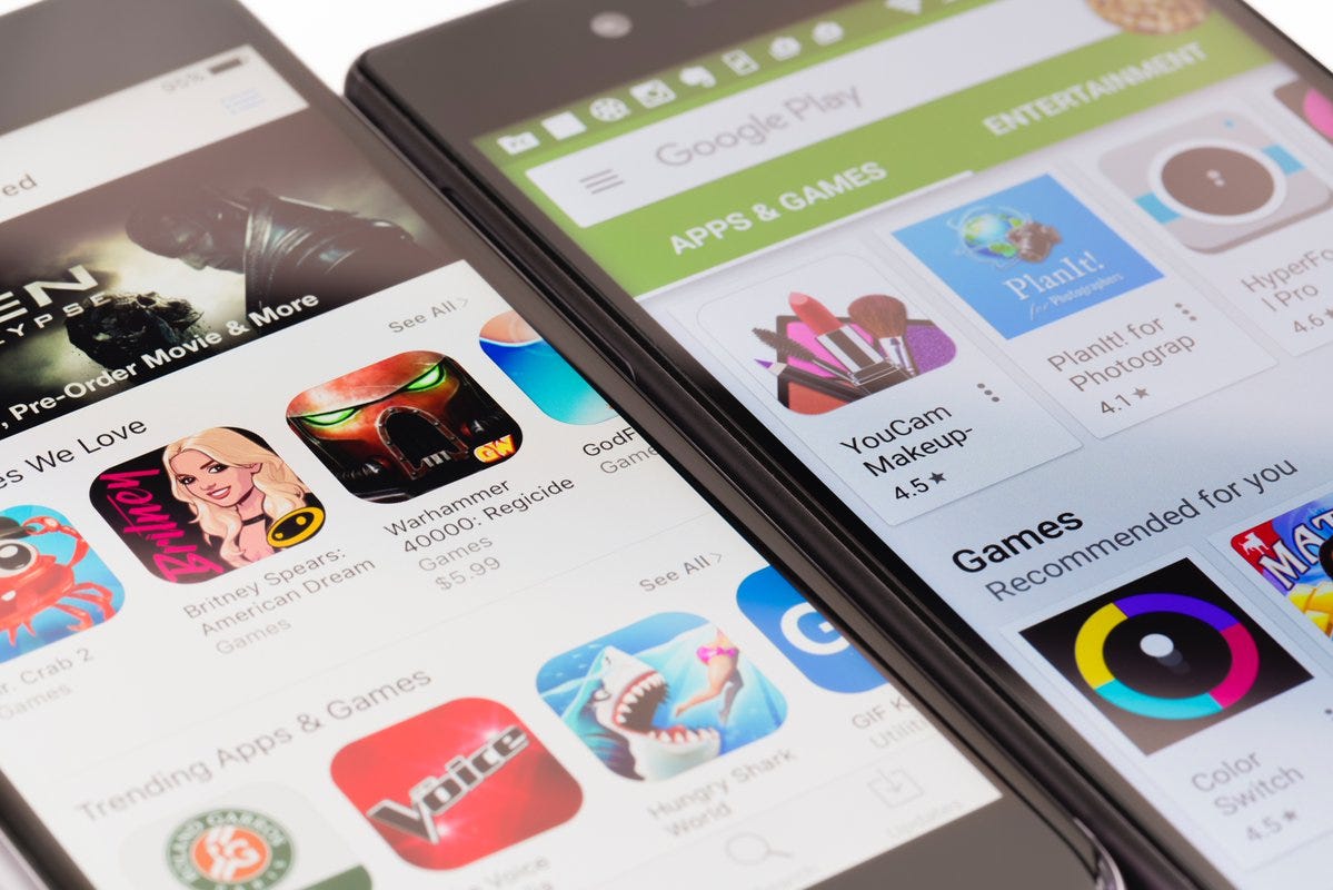
The longevity and widespread adoption of this design pattern across various platforms, not just within Apple's ecosystem but throughout the industry, speaks to its effectiveness in enhancing people’s experience. Whether one is purchasing apps on a smartphone, browsing for videos on a tablet, or exploring music on a desktop, this layout provided a familiar and comfortable environment that invited exploration and interaction. It has become a visual language of digital content navigation, one that we were proud to pioneer.
Instructions on how to access my design services:
Things I started, enjoy and can help with...
The best way to transform a company’s product line from the inside out is to lock 5 people in a room for three months and tell them not to come out until they’ve redesigned the company. Things I Started: 💌 Apple Webmail 🎁 Apple’s first gift card experience


