The Quiet Disappearance of Skeuomorphism in Modern UI: A Re-examination
Designing the Future: Lessons from the Cyclic Nature of Design
Skeuomorphic design refers to a style of interface design where elements are crafted to resemble their real-world counterparts, both visually and functionally. This approach aims to make digital interfaces more familiar by leveraging pre-existing knowledge from the physical world. It often employs textures, shadows, and other cues to emulate materials like paper, leather, or metal, creating a sense of depth and tangibility. Through these visual metaphors, skeuomorphic design facilitates immediate understanding and engagement, offering a bridge between analog and digital experiences.
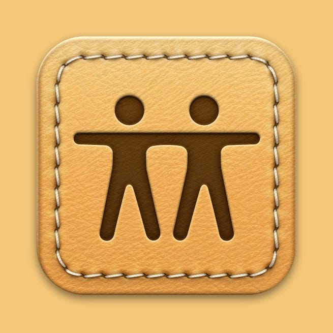
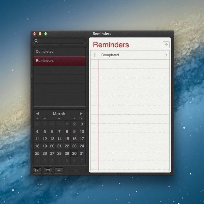
Once upon a time, your digital notebook resembled an actual notebook—complete with leather-bound corners and textured pages. Skeuomorphism—the design principle of making items mimic their real-world counterparts—wasn't just a buzzword but a guiding light in the world of human interface design. Yet, we have witnessed a distinct shift towards cleaner, flatter interfaces. This article aims to explore this change, asking the crucial question: Why has skeuomorphism faded, and what does its quiet disappearance mean for the design community?
The Rise of Skeuomorphism
Skeuomorphism served as a familiar bridge for people crossing over from a tactile, analog world into a novel, digital experience.
Icons, textures, and buttons were crafted to look lifelike, giving software a tangible, comforting feel. Skeuomorphism was less about indulgence and more about facilitating a more familiar experience.
Paradigm Shifts
As technology advanced, so did the expectations surrounding it. High-resolution screens, faster processors, and advancements in graphic rendering offered fertile ground for change. Coupled with the growing maturity of people navigating digital interfaces, skeuomorphism began to seem redundant, if not excessive.
Design began trending toward minimalism. With the emergence of responsive design, the need for quicker load times and a unified experience across diverse platforms became pressing. The skeuomorphic elements that once seemed indispensable now seemed cumbersome.
Case Studies
Consider Apple's transformation from iOS 6 to iOS 7. The shift was radical—the felt textures, leather stitches, and reflective glass gave way to a more subdued interface. It was a shift from ornament to essence, making the UI faster and more responsive.
Similarly, Microsoft's transition from Aero to Metro marked another definitive move away from skeuomorphism. Gone were the glassy, translucent windows, replaced by a stark, tile-based interface.
The Loss and the Gain
There's an argument to be made for the emotional weight carried by skeuomorphic design. The tactile elements, textures, and detailed icons engage people at a level that minimalistic design often fails to reach. However, the trade-offs have been practical—faster load times, quicker navigation, and a cleaner overall experience.
Current Revivals
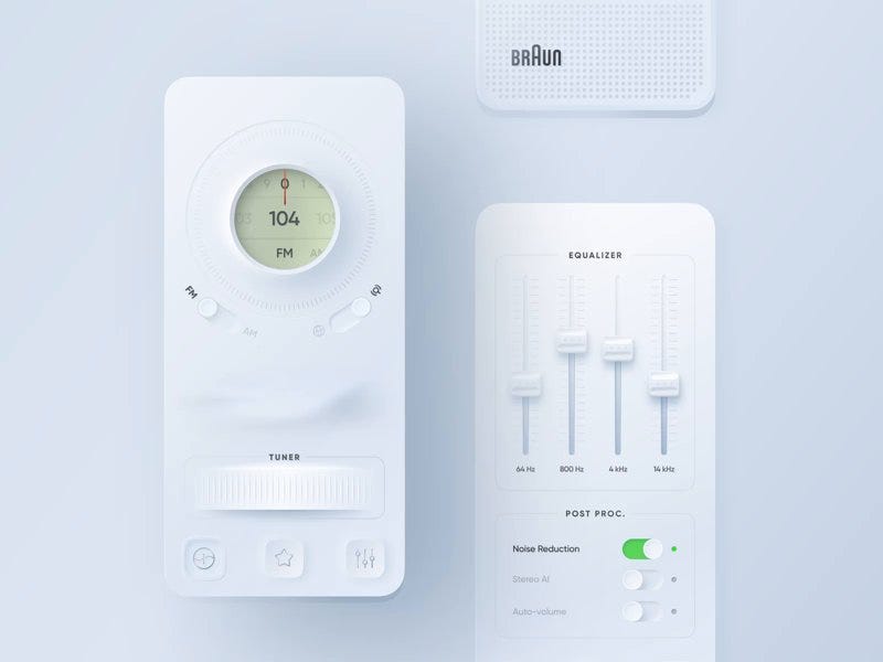
It's worth noting that skeuomorphism hasn't disappeared entirely; it has undergone transformation. We now witness an era of "neumorphism," and “glassmorphism” blends of flat design and old-school skeuomorphic elements aiming to create a more tactile experience within the boundaries of minimalistic principles.
Certain app categories, especially those that replicate real-world objects like musical instruments or specialized calculators, still find value in skeuomorphic design.
Conclusion
The movement away from skeuomorphism is not a linear journey, but a cyclical one. Design philosophies evolve in response to changing technologies and learned behaviors. While the tactile richness of skeuomorphic elements may be missed, the design community has embraced newer approaches to keep pace with changing needs.
However, the cyclical nature of design suggests that we may not have seen the last of skeuomorphism. It serves as a valuable lesson in the balance of form and function, aesthetic and utility—a lesson worth remembering as we continue to shape digital experiences.
The quiet disappearance of skeuomorphism from our interfaces raises essential questions about the inherent tensions between familiarity and efficiency, emotional resonance and practicality. It prompts us to examine the principles we hold dear as designers and to be open to the evolution—sometimes subtle, sometimes seismic—that perpetually shapes our field.
A special invitation from Michael…
Dear readers,
In the spirit of craftsmanship that has always driven our work, I'm excited to share a unique opportunity to be part of a narrative that redefined the digital era. To honor the contributions of our community, I am offering a 20% discount which is good forever for those who join as annual members in the next chapter of this adventure: a book that captures the essence of our design breakthroughs.
Founding members will be acknowledged on the book's donors page in addition to their year membership. Your support is pivotal in bringing this story to print—a story that intertwines technology, design, and the human experience in ways that have forever altered how we interact with the digital world.

Your engagement as either an annual member or a founding member will not only help preserve the rich history of design that we have crafted together but will also continue to inspire future generations of creators and innovators.
I look forward to rekindling the magic that we created and sharing it with the world through your eyes and stories.
Warm regards,
Michael Darius
Darius/Design
Join the conversation on Twitter / X - @darius


